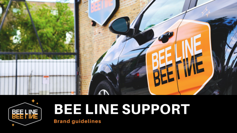
Let’s face it: having a user-friendly, responsive website is critical for getting your business found, respected, and bought from. At Bee Line, we pride ourselves on our ability to think three steps ahead of our competition, which is why we put such a high stake in our marketing and digital presence (a commonly overlooked asset within the janitorial realm).
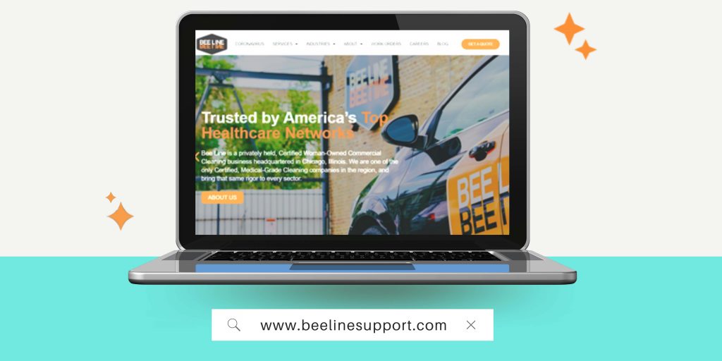
In fact, we’ve come to be a recognized leader in the digital space within the janitorial industry. As we continue to push the needle forward, we agreed that it was time to up-the-ante even further. After almost a year of behind-the-scenes work, we’re proud to begin launching and showcasing our revamped brand, website, and message.
First Step: Intentional & Authentic Re-Branding
First impressions can make or break your chances of landing a new customer, especially in the cleaning industry. As we contemplated the best image for our new website, we realized that before we could discuss any development-level logistics, we needed a revamped brand identity first.
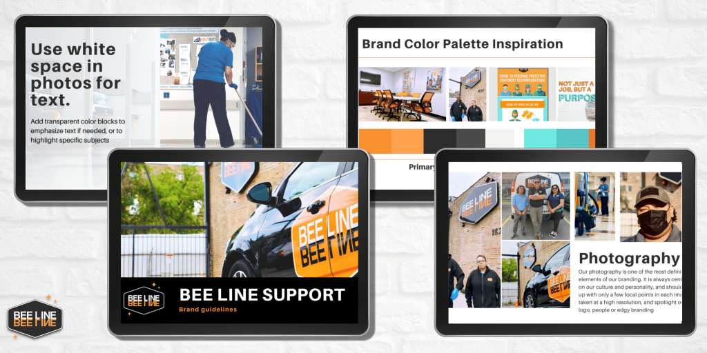
If we were going to pour time and effort into a new interactive website, we needed to be sure that the site reflected our company’s key values, which have always been centered around our people, our leadership, and our expert medical-grade training. Additionally, we needed to be certain that our ideal customers and potential new hires would enjoy our new visual direction, including our colors, fonts, icons, photography, and key messaging.
Without these elements, we would have wasted a highly valuable opportunity. Creating a digital identity helps you to strengthen your brand, connect with your target audience, and leave a lasting impact on anyone and everyone that gets to interact with the new site.
So, before we began developing, we first went back to the drawing board.
Identifying What Makes Up Bee Line’s Brand
Our new brand had to capture the essence of what it means to work for and work with Bee Line. This included:
Highlighting our brand personality:
Modern
Team-Oriented
Urban
Innovative
Bold
Clean (pun intended)
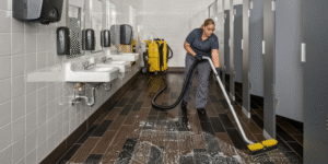
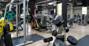
Showcasing many, many photographs and videos of our people and our outstanding culture
Emphasizing our values, mission, story, and value proposition
Using bright colors to capture the vibrancy of Bee Line, and clean space and backgrounds to emphasize only the most important elements of our brand
We all agreed, no matter what we designed or how we chose to build the site, our number one focus was on emphasizing our people, our personality, and our one-of-a-kind brand.
Once these elements were decided and agreed upon, it was website time!
2nd Step: Website Re-Design
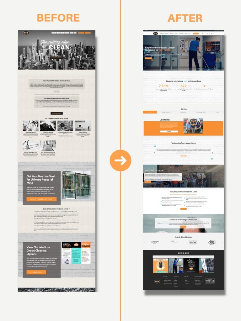
If pictures can speak a thousand words, this before and after photo speaks volumes.
Improving the User Experience
Our previous site was originally branded to fit the motto “The Cutting Edge of Clean”, and was stylized in a black and white, urban aesthetic that played up the “edginess” of our company. At the time this image served its purpose dutifully and gave a nice, high-level preview of how we tackled messes.
That said, once we fully audited the site for the brand revamp, we recognized that although the site was catchy, we were barely scratching the surface. The previous site failed to tell a story, highlight our culture, and missed the mark on efficiently leading visitors to the appropriate page.
In the rebuild, we made sure to:
Showcase our incredible talent in imagery and section across the site
Boldly highlight just how different we are as a cleaning company (adding facts and images reflecting our modernity, diversity, training, and more)
Delve into all of the different services AND industries we work with
Clearly guide the viewer through an experience – learn about us, learn how we can help you, and then easily request a quote
We didn’t want any confusion as clients worked their way through the site, so we laid out a site map that was easy to navigate. We optimized for white space, bold headings, and clear copy that tells viewers (clients and job seekers alike) only the information they need to make a decision.
Improving Mobile Responsiveness
We also recognized that the website was not mobile-friendly, and took way too long (up to seven seconds!) to load. That is the fastest route to having a new audience member leave your site. In the rebuild, we built the site on a new server platform, WordPress, and made sure that every element we added to the site was mobile-friendly, fast-loading, and SEO optimized.
Off to the Races
After months of back-end development (thank you Operation Technology) and front-end brand build-outs (thank you ShineThru Branding), we are beyond excited to finally launch this modern reflection, Bee Line 2.0 if you will, out into the world! Take some time to peruse the site, and if you’re inspired, let us know what you think!

About The Author
Jamie Henry
author
Jamie established Bee Line in 1997 and hasn’t looked back since! She is originally from Chicago, but lived in Florida for 10 years, and claims that she is a “displaced New Yorker” despite never living there. In her free time, you can find Jamie walking her pup, Moose, around the city, and learning new hobbies, like learning to golf and piloting planes! Her favorite part of leading Bee Line is working with her team to grow the company and cultivate a positive and thriving culture. Jamie won a 19th Annual Enterprising Women of the Year Award, one of the most prestigious recognition programs for women business owners in the U.S. and globally!